Talent platform / UX redesign
Built by developers. Redesigned for users.
Seeneemaa is a platform for the Telugu film industry connecting talent and recruiters. The product was already built. The designs needed to catch up. We redesigned 23 screens across two user roles in 3 months.
The problem
Seeneemaa had a feature-rich web application ready to go. The development was done. What the platform lacked was design.
The existing screens were built by developers, for developers. Information hierarchy was unclear. Navigation required too many steps. Consistency across screens was missing. For talent coming from tier 2 and tier 3 cities, accessing the platform on lower-end mobile devices, the experience had real friction at every step.
The founders had a clear vision for what the platform should feel like. The product did not yet reflect it.
What we delivered
A redesign of 23 screens across two user roles, working within the constraints of an existing codebase. No major development overhaul. Incremental, targeted design improvements without requiring a rebuild.
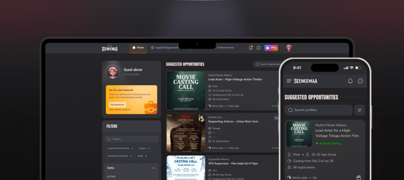
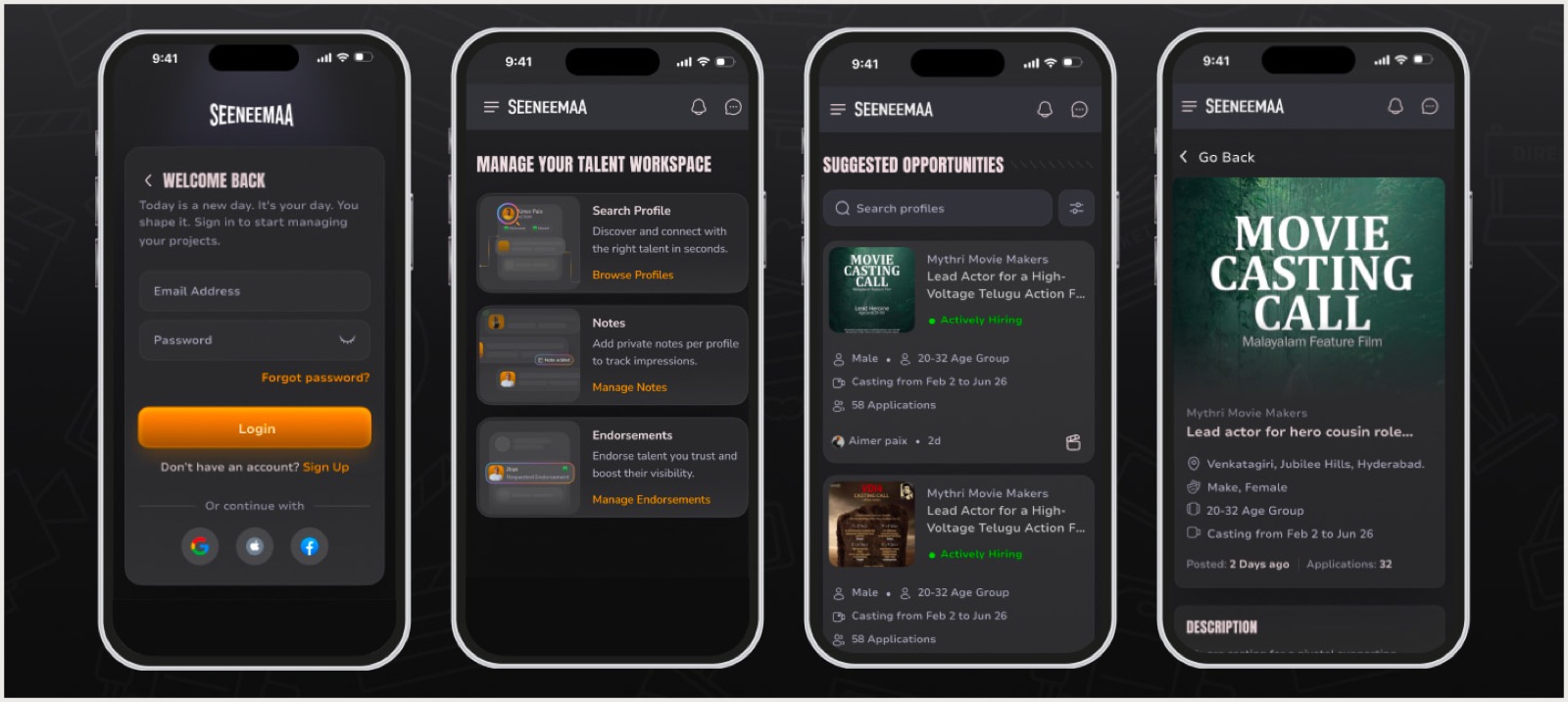
Talent screens
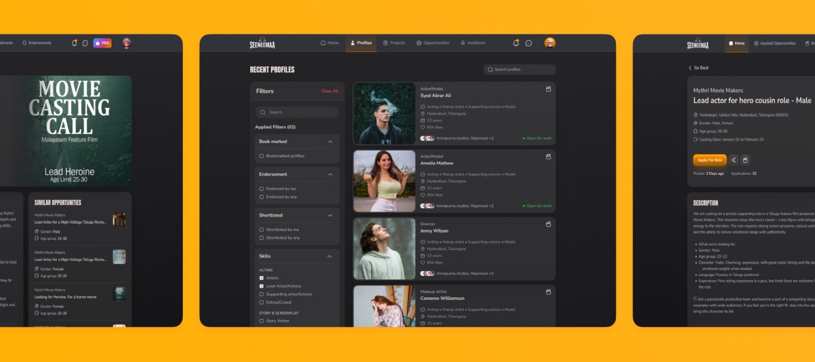
Job listings, job details, applied opportunities, bookmarks, profile creation, and endorsements. Redesigned for clarity and mobile usability, with a clear information hierarchy at each step.
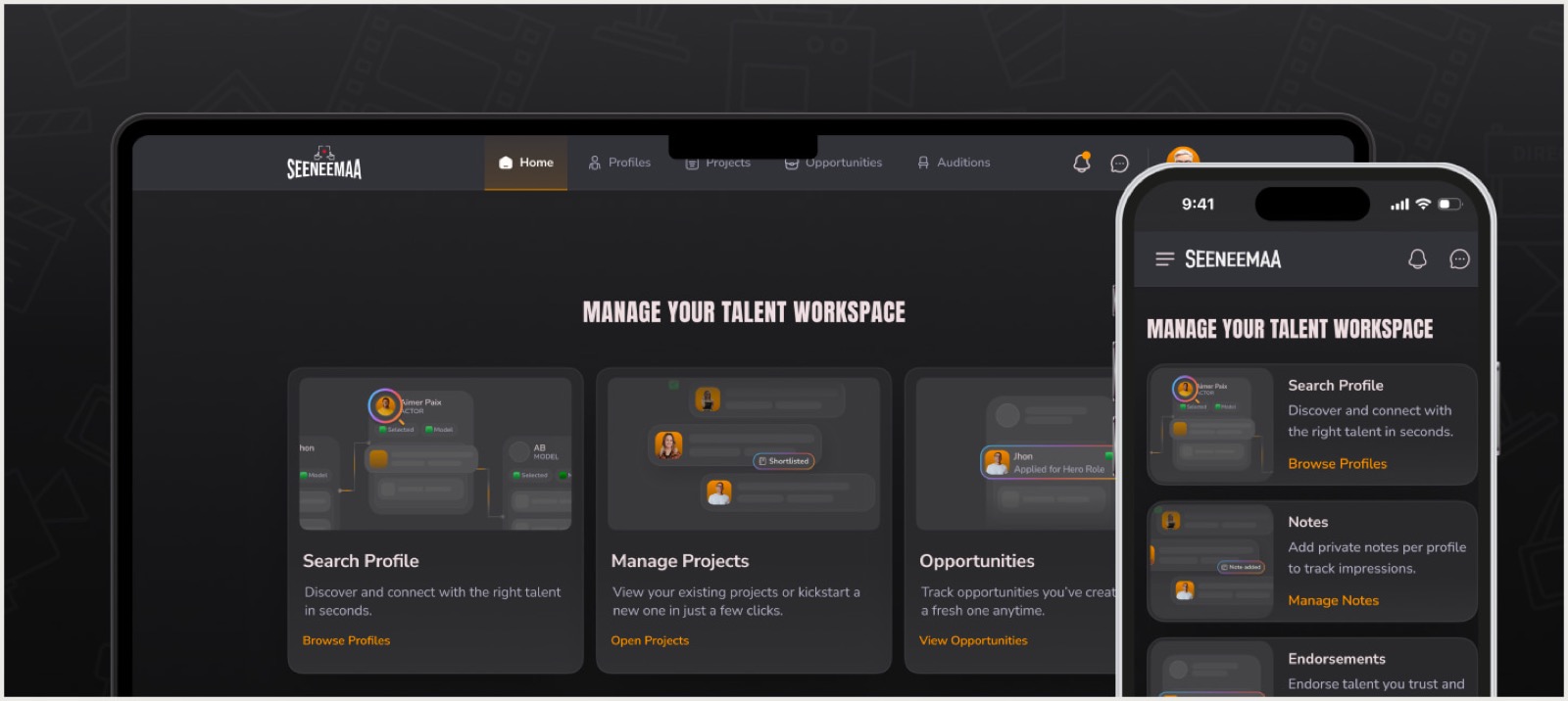
Recruiter screens
Talent listing, talent details, job creation, saved profiles, jobs created, endorsements management, notes, and projects. Structured to reduce friction and make key actions reachable in fewer steps.
Common screens
Sign-up, login, forgot password, landing page, and messages. Redesigned for consistency across both user roles with a unified design language.
Dev-ready handoff
Figma files with detailed annotations, interaction guidelines, and separate mobile and web flows. Organized for direct developer handoff without back-and-forth.
The approach
Development was already done. Any design change that required significant rework was off the table.
We started with a full UI and UX audit of the existing platform, mapped the information architecture, and identified where the experience broke down most. From there we worked screen by screen: tightening layouts, establishing a consistent component library, improving navigation flows, and optimizing every element for performance on lower-end devices.
The mobile-first requirement shaped every decision. Lightweight UI components, simplified interactions, and clear visual hierarchy that works at smaller screen sizes and slower connections. Each screen was reviewed against the development constraints before being finalized, so the handoff files reflected what could actually be built, not just what looked good in Figma.
The outcome
Seeneemaa now has 23 redesigned screens with a consistent design language across both user roles. Talent and recruiters each have flows built around how they actually use the platform. The designs are mobile-first, optimized for lower-end devices, and ready for development implementation.
The engagement ran from audit to handoff in 3 months.
Have a product that needs to catch up on design?
Tell us what you're building. We'll tell you honestly whether we can help.